We animated the logo to give it more life and to keep it fun. We played with the colours, lines and shapes that were already in the logo to give it continuity. The smooth transitions and morphing of lines into shapes reflected the spirit of Vivira Mall. The animation was very brief and we made it as the loader of the website! Pretty cool right! We knew that it deserved its story to be told and therefore had a dedicated space for it on the website.


The brochure for Vivira Mall was designed to invite both local and international brands to open a store at Vivira Mall. It was perfectly laid out, focussing on the statistics and facts on why these brands should opt to lease a space for Vivira Mall. It showcased the existing shops, its close proximity to residences and offices in the OMR belt and the future of the locality.
The colours reflected the official brand colours, reiterating the image of the mall. It had a systematic flow to it and every topic effortlessly lead into the next. We covered all the important aspects of the mall that a prospective seller would want to know and thereby earned the respect and appreciation of the client who wanted us to develop a website for Vivira Mall as well!
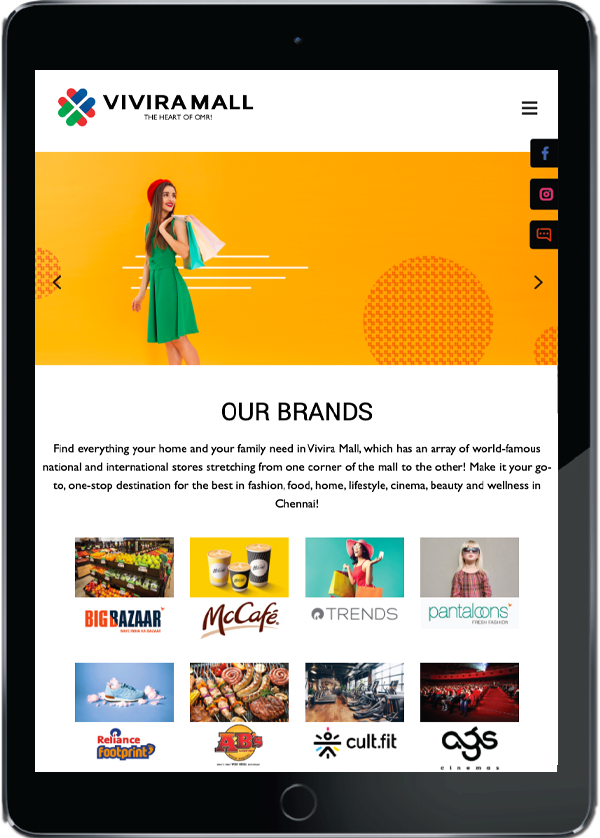
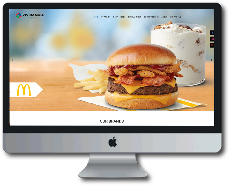
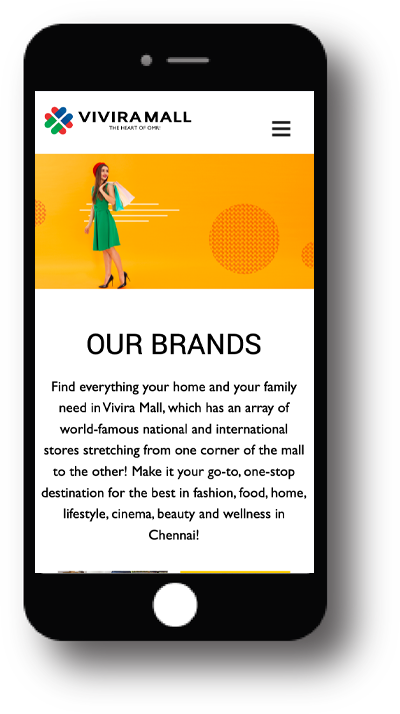
Vivira Mall’s website had to be simple yet informative. This is because the mall housed quite a few stores and details had to be given about each of them. They were segregated into the kind of establishment it was and who they catered to. Once segregated, details entailing the history and authenticity of the stores had to be conveyed in a short and crisp way to allure the customers in.
The design followed suite to be simple, straightforward and fun reflecting the colours of the brand. The website was designed to offer easy guidance to shoppers whether they came looking for clothes or fitness, or food or grocery or even for movies. The website was designed to let the customers find links to movies they wished to see for easy booking.
The development was seamless. The pages and sections neatly transitioned from one to another easily and quickly, though it was a pretty heavy site. Micro-animations through the site made the website fun and pleasant to look at. From the images to the colours and animations, the website was developed to market the mall superbly!
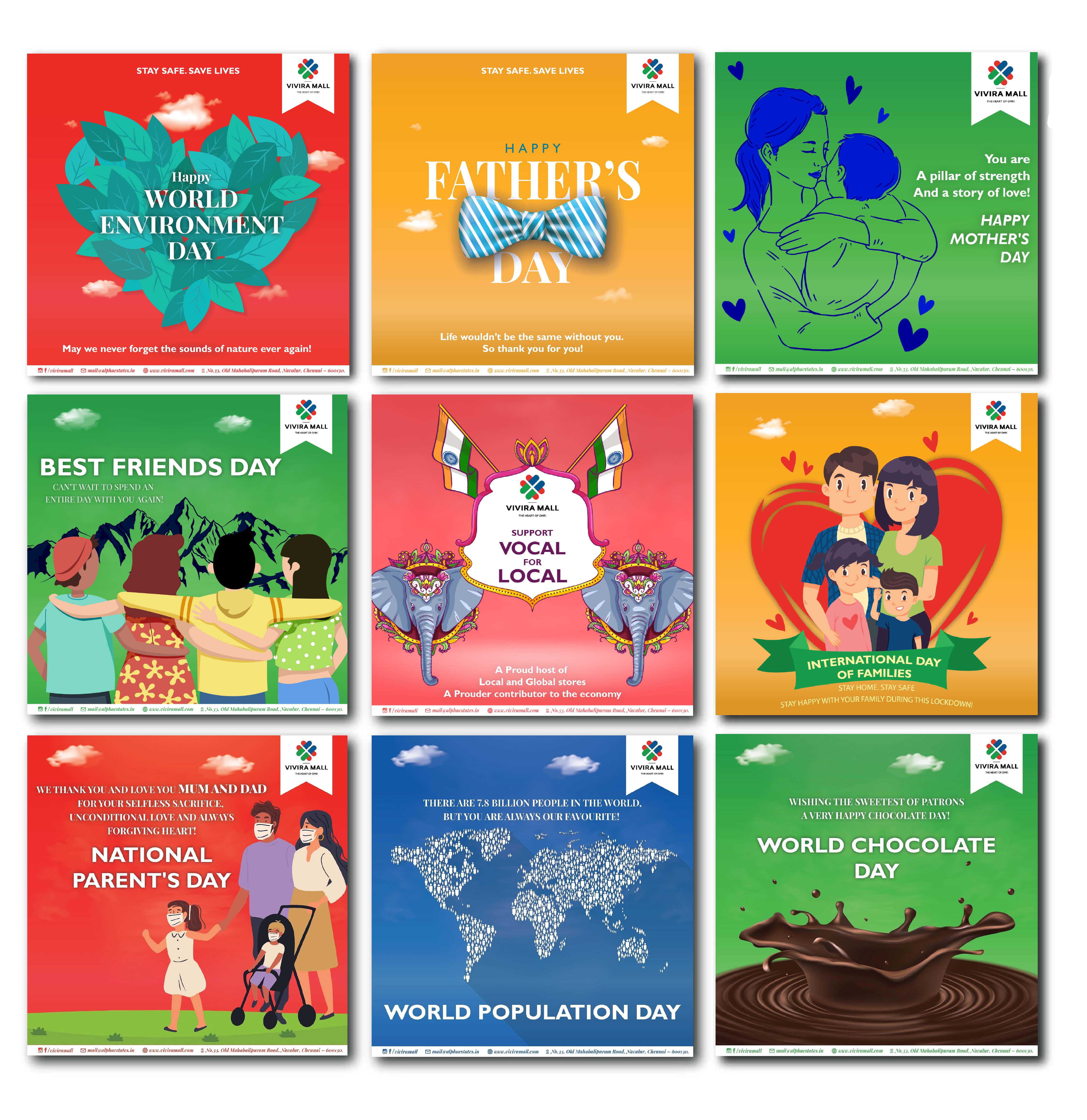
We designed creatives for Vivira Mall on a regular basis. A set of creatives highlighting everything the mall has to offer and highlighting the important days of the year were done and given to them with a tagline. The creatives were mostly cartoons depicting the importance of a red-letter day or if it spoke about a particular brand, images synonymous with the brand were chosen. Their Instagram page had a vibrant look and feel to reiterate the mall’s tone of voice. The aim was to increase footfalls to the brand by increasing its awareness on social media and we succeeded in our quest.
