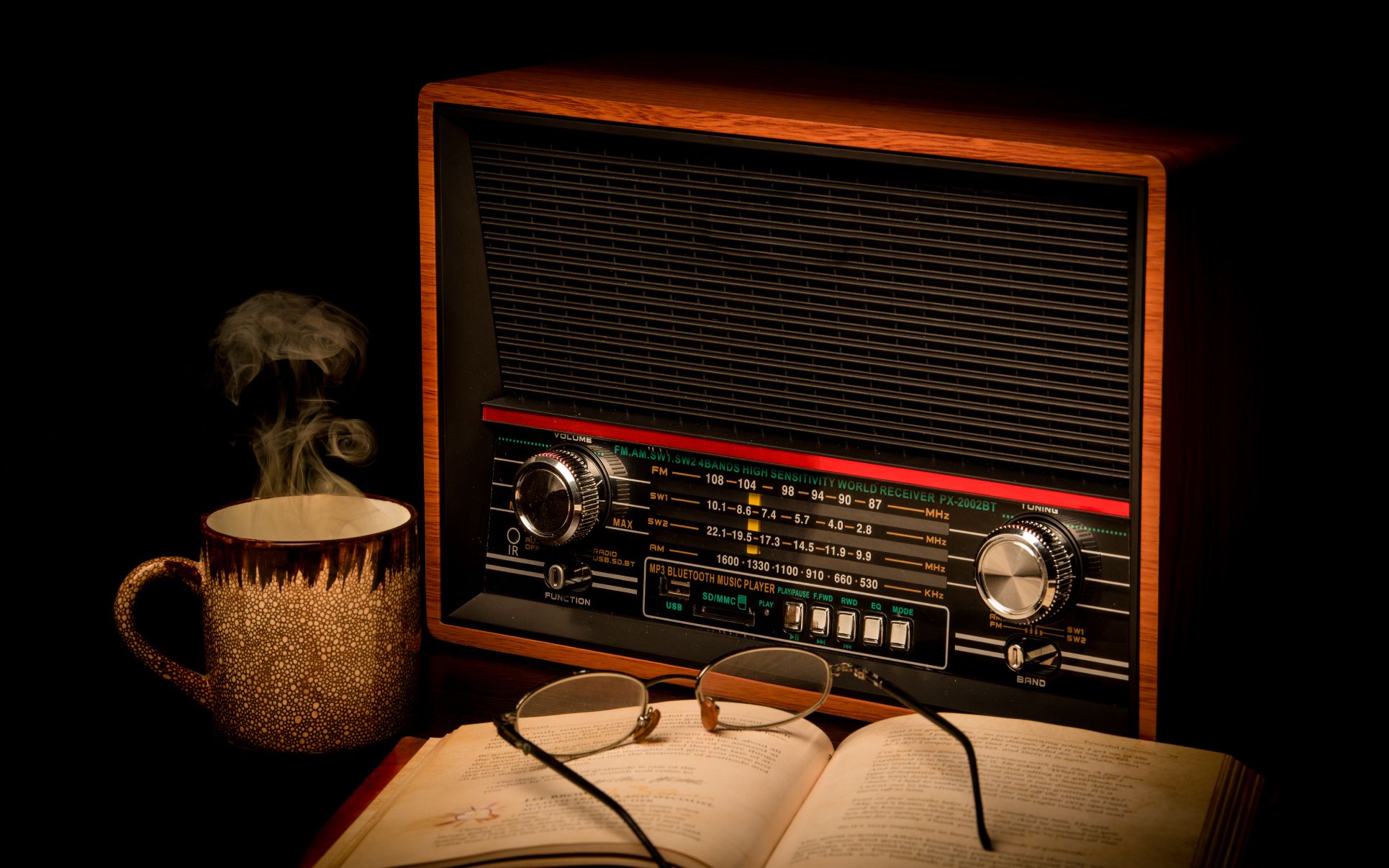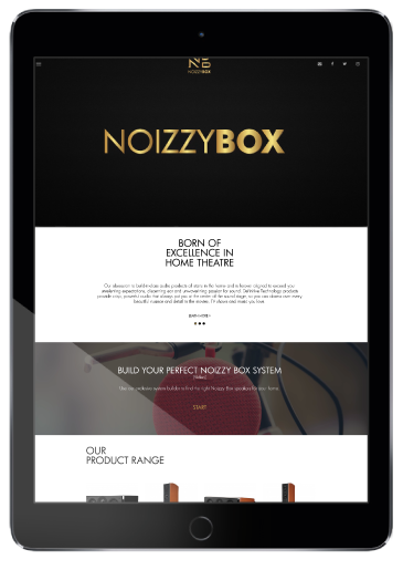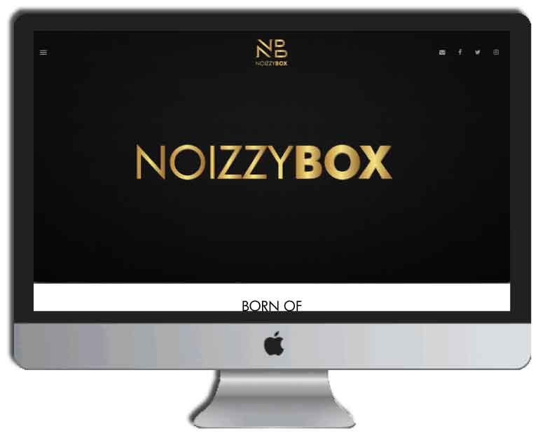
This is a brand having retro and other styled speakers under its umbrella. The brand tasked Tablo Noir to create a design for the website which would be unique and showcase each of their products prominently. We got to work and curated the content to fit the design for each of the 15 products under their wing. This website was designed and developed to be unique and stand out in a crowd.


The client was thrilled with all the attention the brand was getting through our work and campaign for them and asked us to design a new product for Noizzy Box! We had to understand the technical aspects of the speaker so that we could design one that could fit in their many components. The general idea was to design a product that would follow the retro style to keep in line with their theme. So our designers and animators got working to design the most perfect retro speaker that aligned with our client’s requirement. The end product design housed the woofer speakers, the Noizzy Box logo, the multiple ports for charging and headphones and finally a memory card slot!
What better way to showcase a retro speaker than through videos! The themes we used revolved around retro and music because those are what makes Noizzy Box what it is! Being all things retro was the inspiration taken by the designers and once they designed an epic creative the animator would animate the various elements in the post. It was fun to see the outcome of these videos and they gave Noizzy Box the spotlight they needed on their social media platforms.
Apart from giving Noizzy Box an online presence we also got them to be published in newspapers and magazines! The advertisements would contain a write up about the speaker in the focus with all its features and description, the colour options available and also the unique selling points of the speaker. We would also mention the other speakers that Noizzy Box housed to indirectly market those as well. The creative would reflect what the brand stands for, with an addition of a quirky headline that mirrored the essence of Noizzy Box! This did give the brand traction from a different point of view!
Another aspect on the website which the client wanted us to work on was a video to showcase the identity of the brand. The video was created specifically with music and animations to make the logo stand out. The style, the animations and the flow of the website is a perfect definition of what the brand is.