


Afrimet was an educative project for Tablo Noir. We learned so much about the trading and supply chain management of Tin, Tantalum and Tungsten, sourced from Africa. The logo was creatively designed to stress the minimalistic approach of the customer when they source these raw materials. The logo was simple yet awe-inspiring thanks to the artistical placement of the African continent in the letter “M” along with the generous use of negative space to portray the identity of the brand!
The brand manual for Afrimet Resources was designed to showcase the guidelines needed to use the logo correctly wherever it was incorporated. The brand identity manual focuses on the brand story, the primary and secondary colours to be used when utilizing the logo, the inspiration behind the logo, the typeface/fonts to be used, the do's and don'ts of using the logo and the clear space to be maintained around the entire logo element.

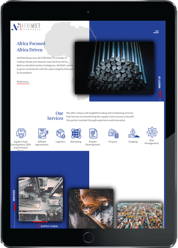
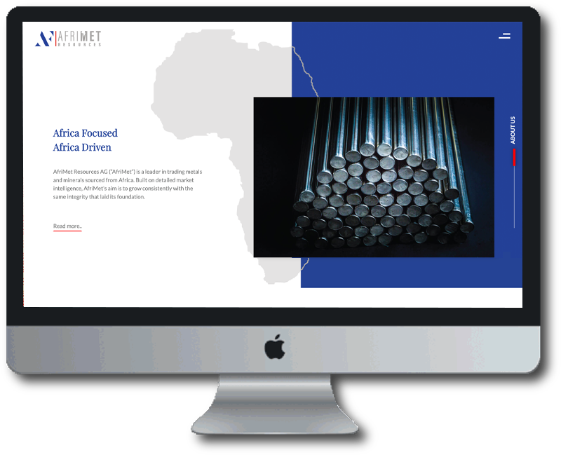
Educative and informative the website had to be and that’s what we strived for. The website was clear and simple enough to be understood by prospective customers and instructive enough to explain all that Afrimet had to offer. The website was seamless in design and navigation. The purpose of the website was to shine a light on the minimalistic approach taken by Afrimet and the tone was to keep it simple and informative and this was easily achieved by our team, making our client thrilled and happy.

Address
Tablo Noir Pvt. Ltd.
2C, Crystal Lawn, 20, Haddow’s Road,
1st St, Nungambakkam,
Chennai- 600006, Tamil Nadu.
