A Logo is the face of a brand. All businesses need and want to imprint their image in the minds of the customers to establish their brand. Customers will see this crucial visual identity over and over again and this will be the image that comes to their mind every time they think of your brand. Though it is not the only element that makes your business stand out from the crowd, it will definitely give the customers the first (and hopefully a memorable) impression of the product. Here’s a list of the current logo design trends used by designers to make the first impression, the best impression!
Using the brand’s name as the logo is still one of the best trends in logo designing. Although it may look simple, it is straightforward and never goes out of style. There is a lot of room to experiment and different styles that can be employed to bring to life the name of the brand. A few of those styles are split typography, handwritten typography, and messy typography. There are so many more styles where typography is concerned, and they do have a huge impact on the identity of the brand.
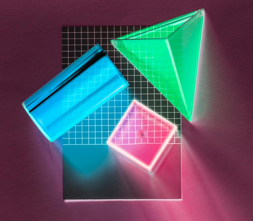
Designing a logo using basic geometric shapes keeps the logo as simple and elegant as typography does. Endless creativity can be enjoyed from basic geometric lines and shapes. Minimal geometric patterns on logos allow for easy readability and recognisability. When more than one geometric line is combined and layered, it generates a simple and classic logo design that’s easy and elegant on the eyes.
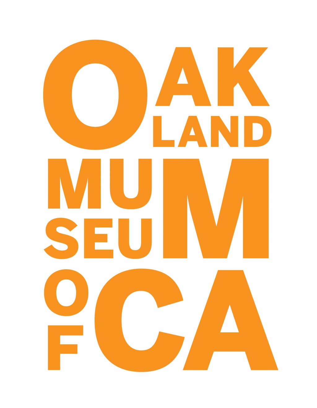
Letter Stacking is one of the logotypes that are here to stay. Though it was started in 2016, businesses still want this, as it is bold, unique and catchy. Letter stacking is an ideal logo design for businesses that have long names. In this trend, the letters of the words are stacked one above the other and side-to-side to knit them snugly to each other. Similar to the other logo designing trends, there is a lot of room to experiment on, in this logotype as well.
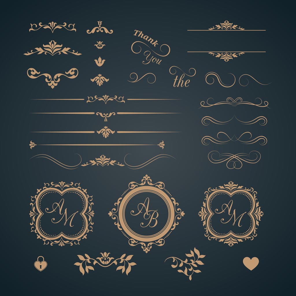
Wikipedia describes a monogram as a motif made by overlapping or combining two or more letters or other graphemes to form one symbol. Using the monogram concept to design a logo is one of the best ideas that has been and will continue to be in use for a long time. Businesses looking for a sophisticated and classy visual identity should go with this concept. Usually, the initials of the business are used to create these monograms by merging them together using simple, elegant fonts to bring out a neat look for the logo.
In this digital era, clients want to make the most of the available technology. Videos have made everything better and happier, so much so that designers have started employing them in logos as well. These little animations in logos are catchy, interesting and grab the attention of the consumers as soon as they see it. Animating the logos brings them to life and the good news is that existing logos can also be animated to make them more fun!
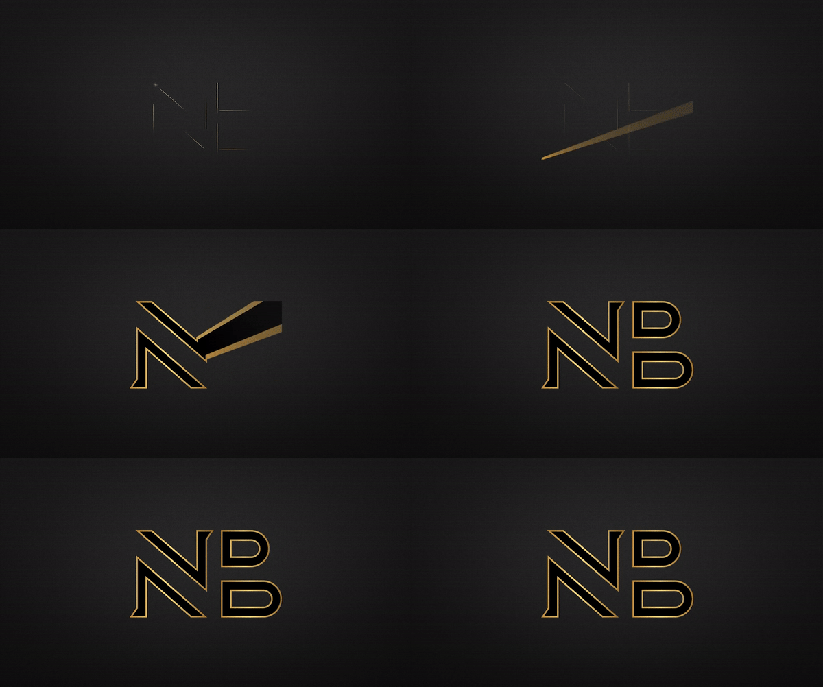
Do check out our entire work for Noizzy Box.
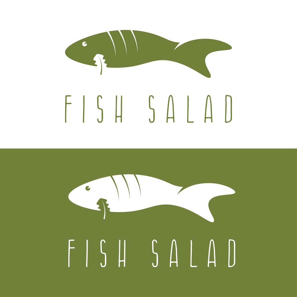
This is one of the most creative ways of designing a logo and though it has been around for a while, it is still trending. Negative spaces ensure that there is enough breathing room for the elements in the logo. Negative spaces draw out the shape or images concealed inside or between the logo texts.
Designing the logo is the first step in creating an amazing brand identity as the design and branding that follow will be in the same tone of voice. Logos need to be simple without many details, versatile to look amazing on various platforms, appropriate to represent the brand in the colours and font used and most importantly unique to stand out from the crowd.
To get your logo designed using the latest trends contact us at Tablo Noir!